Candid Design System
Creation of shared Adobe XD library of reusable brand assets and components
-
My role
Project lead -
Team
Beth Culp and Barsha Maharjan (UX Designer) -
Timeline
Ongoing from 2020 - May 2021 -
Tools
Adobe XD, Material-UI
Project Overview
In February 2019, Foundation Center and GuideStar merged to become a new organization, Candid. With this merger came entirely new branding for the organization. With over 40 web properties between the two organizations, there was a mountain of rebranding work to be done. This presented an opportunity to streamline our design process among our internal 5-person design team. I was the project lead on developing our first Candid design system on Adobe XD. Based off of components and patterns from Google's Material-UI, we created a shareable design library used both by our internal design team and external consultants.
What I Learned
This project presented huge learning opportunities for me. It was my first time creating and adapting components, a complete gamechanger for my user interface design processes. The design team was constantly in communication about our ongoing projects, and new challenges and branding guidelines were being established as we went. This UI library was being updated in real time as our branding evolved, which was a new challenge that enforced the importance of constant communication with the team through various iterations.
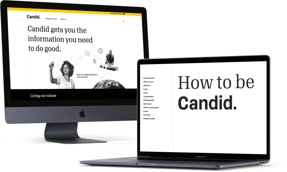
Launch of "How to Be Candid" in 2019
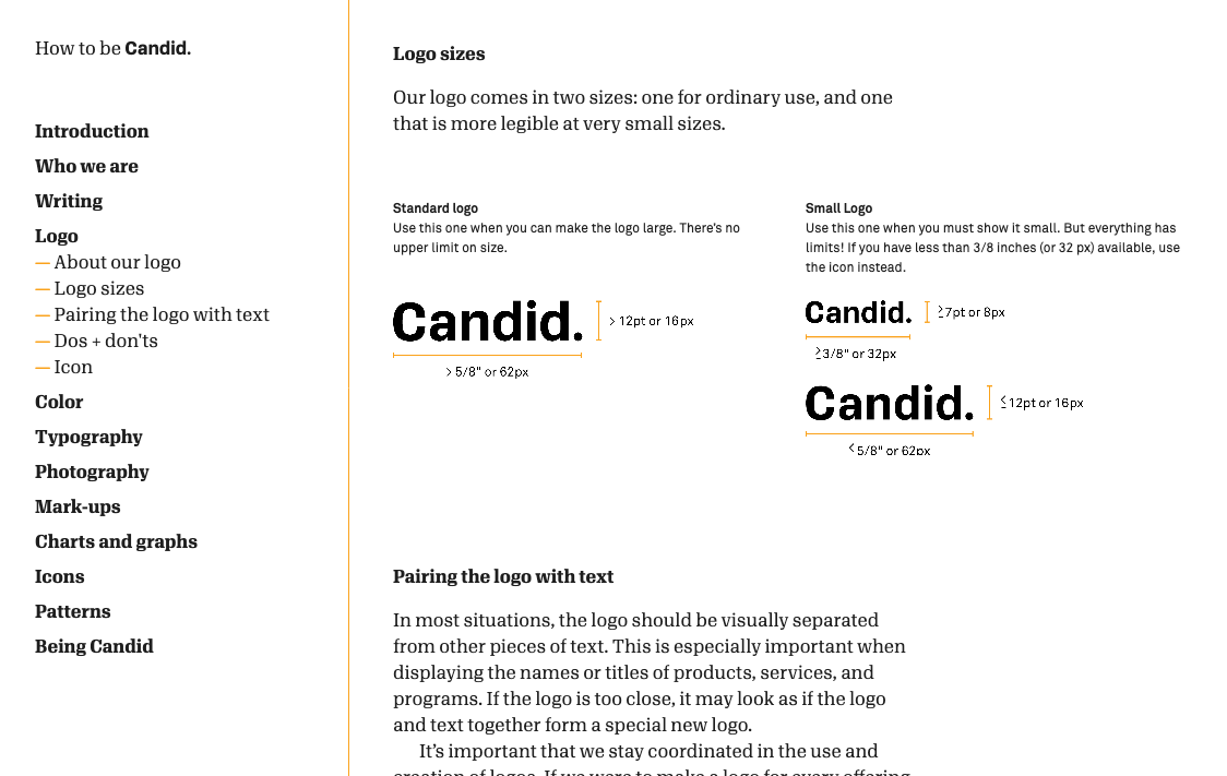
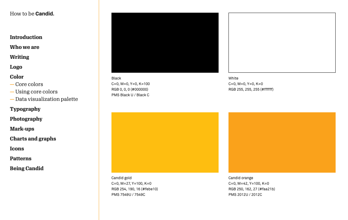
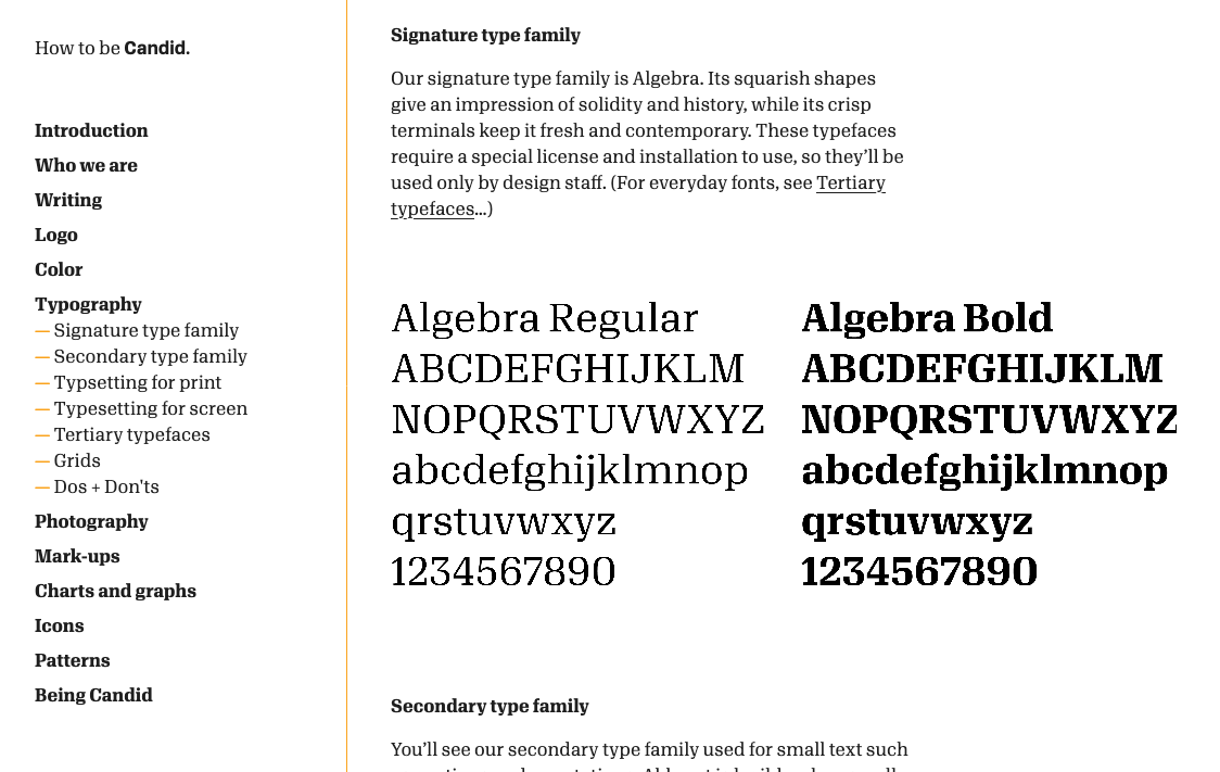
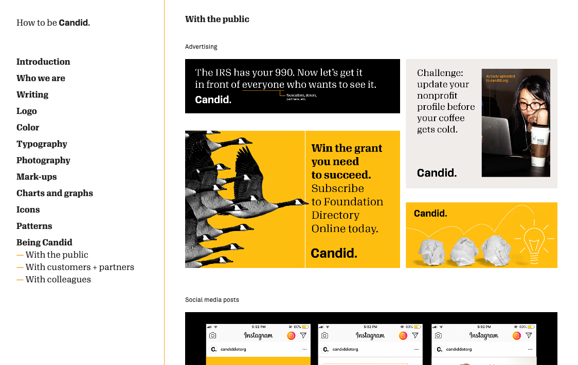
Everything started with our Candid Style Guide. Developed by Open Design Studio, our in-house design team had ongoing conversations and input. The style guide was invaluable in providing branding guidelines for the logo, typography, photography, writing style, and more.
However, much of the initial style guide was aimed toward guidelines for print materials - there were still many patterns and rules we had to decide for user interfaces. The designers on the Candid design team started running with the process of rebranding our many web properties.
Rebranding our Websites
Applying our branding to our various web properties was a daunting task. Foundation Center and Guidestar had about 10 primary properties, plus a myriad of individual products and client-funded portals. Most of these were built on different content management systems and frameworks - EZPublish, HubSpot, Wordpress, Angular.
Many of these properties started being redesigned individually, on their own systems. One goal of the new Candid branding was to remove the differences in styles between the various properties. As the sites were being redesigned, it was clear the amount of similarities between the sites would be huge. There was an opportunity to eliminate development effort of redesigning by having one consistent stylesheet or system - one source of truth.
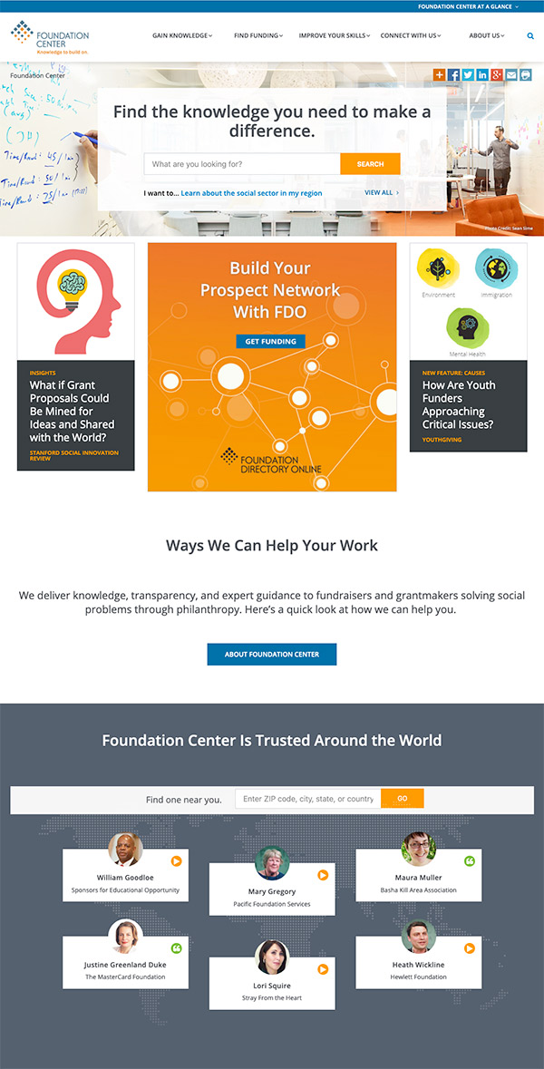
Foundation Center
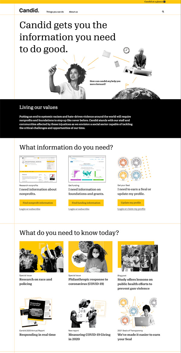
The Foundation Center website was redesigned to become Candid.org. Being part of the Candid design team, I was a source of feedback and innovation for how to reorganize the information architecture and implement the new branding onto the site. I took the lead on the front-end development for converting the current EZPublish styles and templates to support the new design.
GuideStar
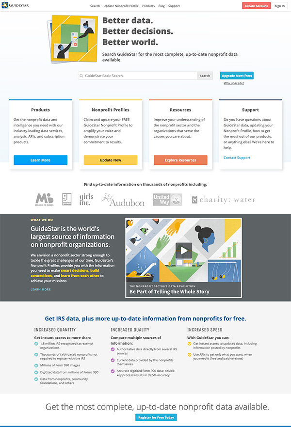
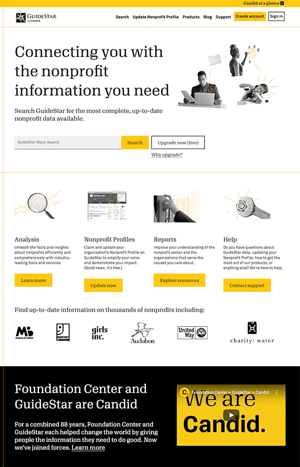
While GuideStar.org had become part of Candid, the name GuideStar would live on as it's own product. The GuideStar website and application were both given new styling to match the Candid brand.
Why did we need a design system?
-
Different Programs
Each designer was using their preferred program to create designs - Illustrator, XD, or Photoshop. Having a shared library would help us all design faster. -
Inconsistent Details
While we all knew the style guide like the back of our hand, we didn't have clear rules for the minutia of user interface design - how much padding did a button get? Which font should be used for tabs? This led to slight inconsistencies in all of our designs. -
Developer Guesswork
Since we had inconsistencies in our designs, the developers also had inconsistences when creating styles and were largely guessing on specific styles from the art files. This could be eliminated if we were able to give the developers a library to reference.
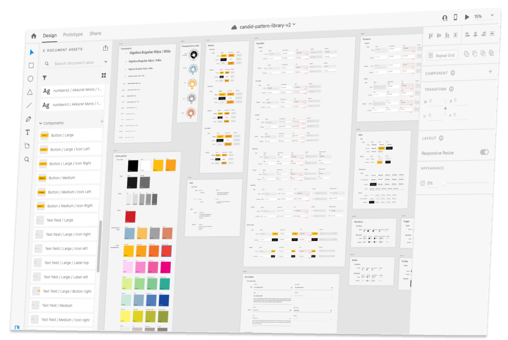
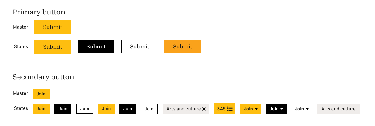
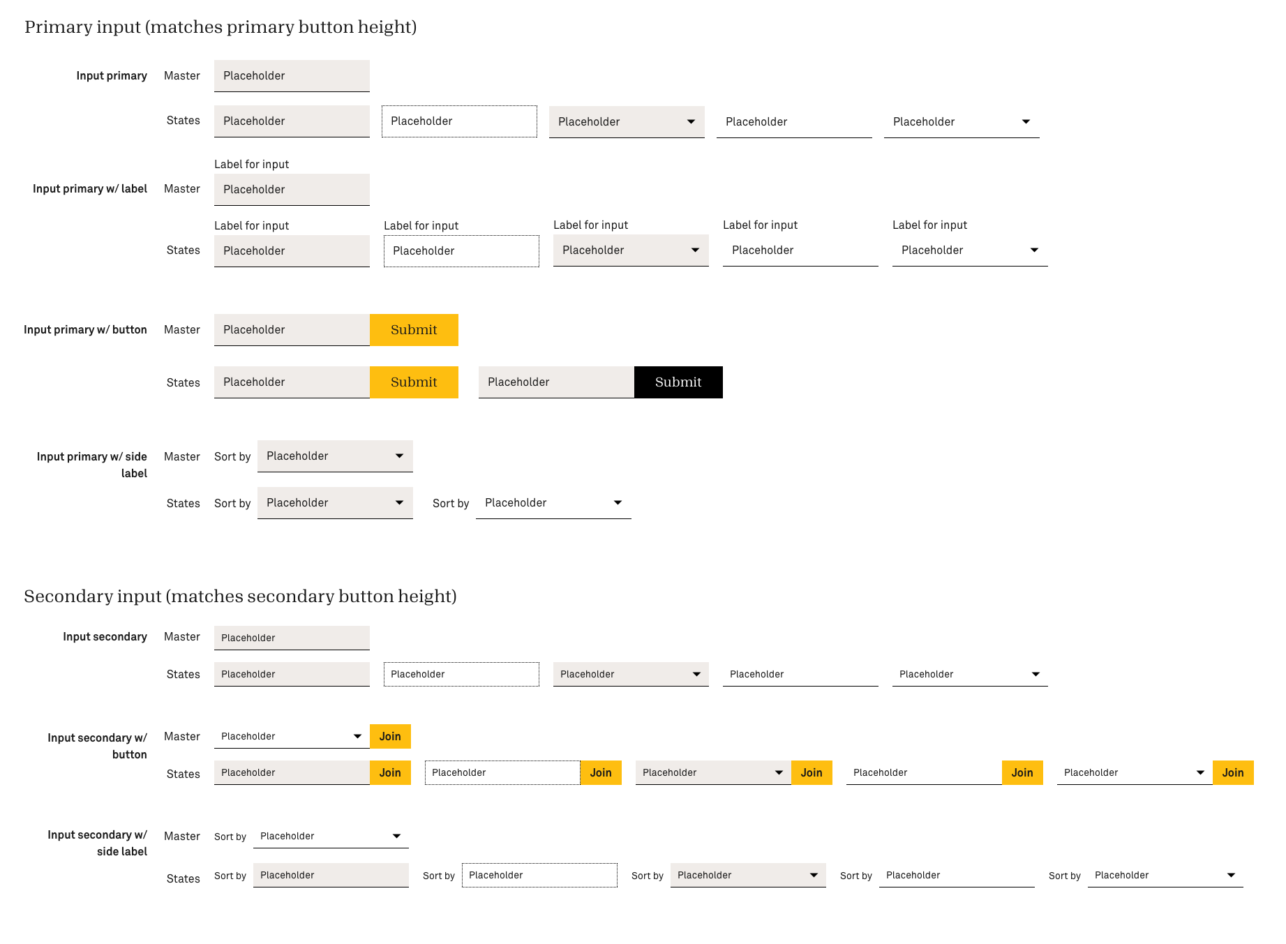
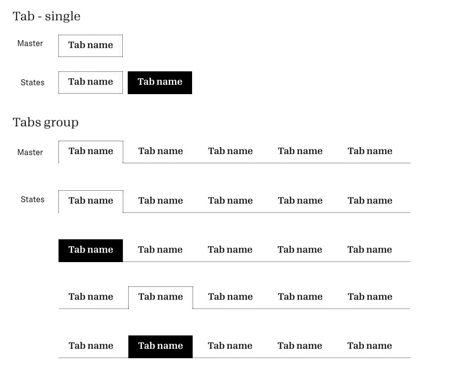
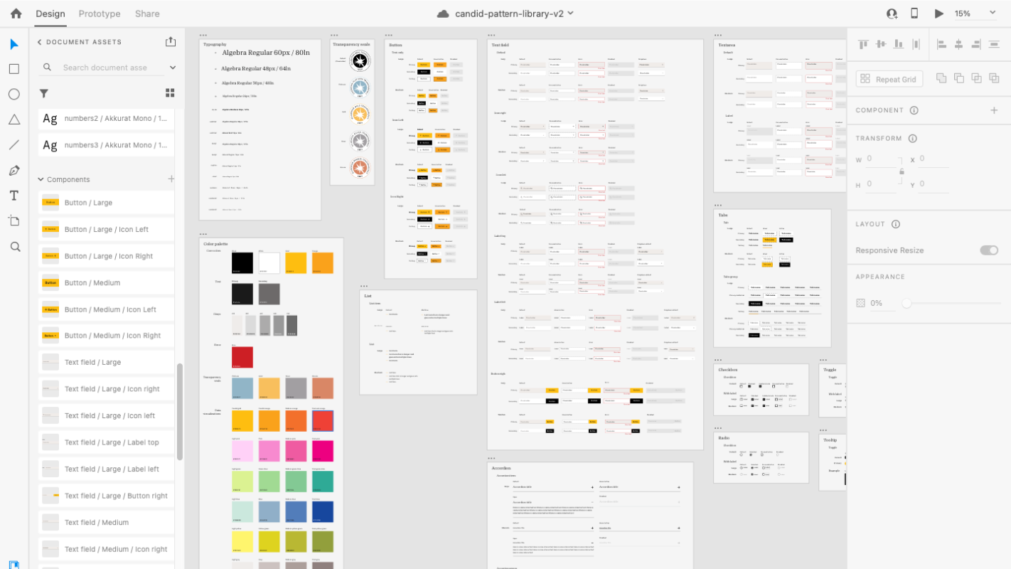
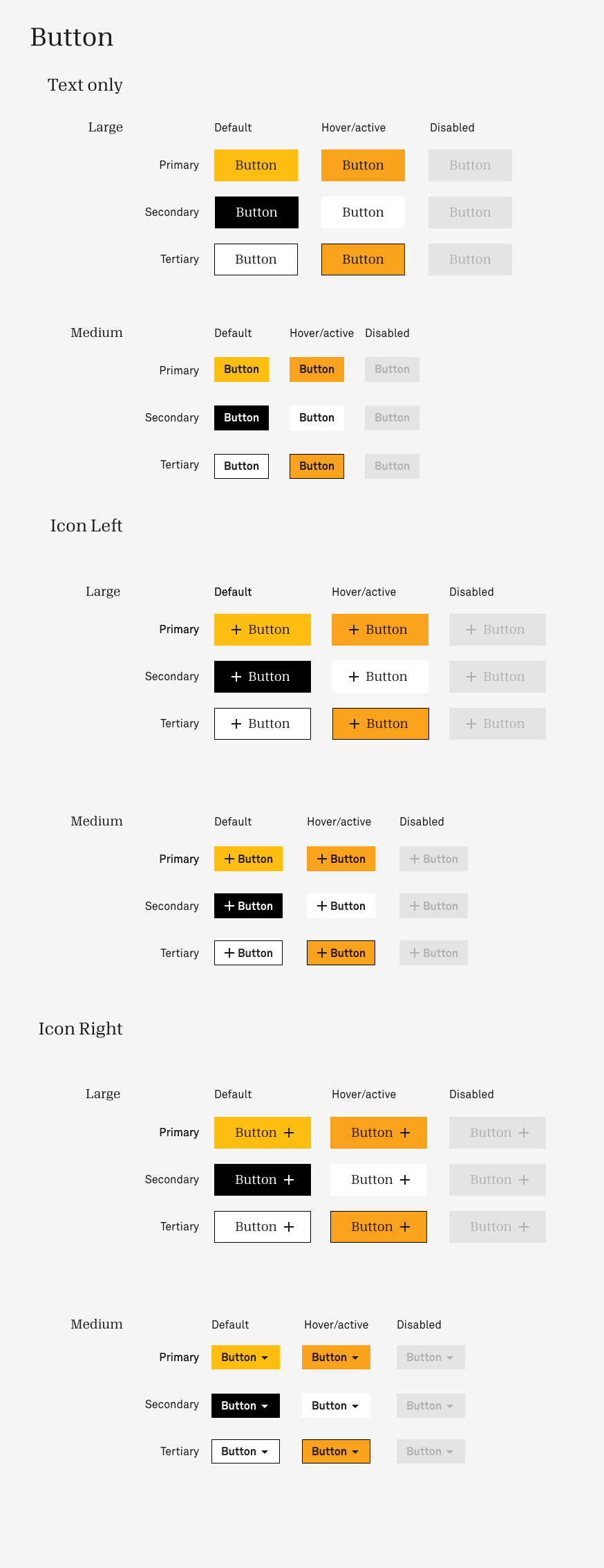
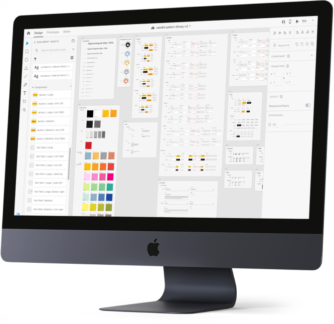
Candid Components, version 1
I took the initiative to start researching and learning more about Adobe XD's design system functionality. I learned about the components feature, and started creating components of our most commonly used UI elements, with the states I had used and seen used by other members of the design team.
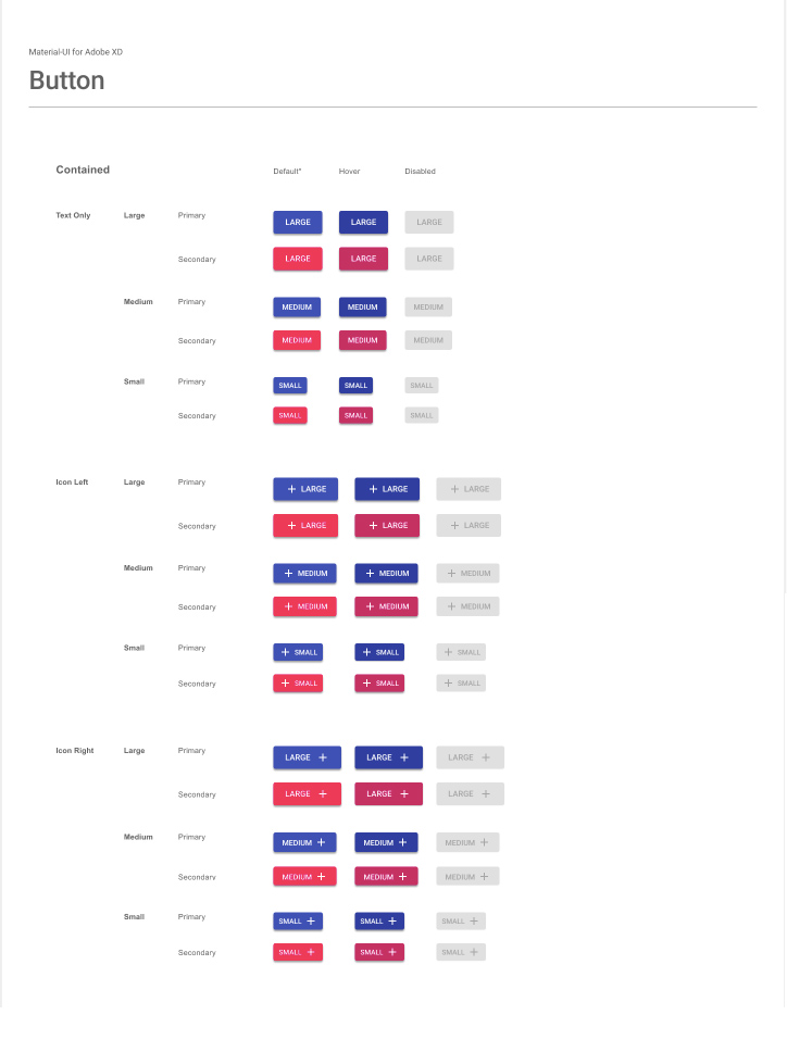
Material-UI Framework
One of our internal systems was being completely rebuilt using the React javascript framework. This presented an opportunity to implement our branding onto a pre-existing React design system that could be reused by developers and other applications.
After much internal discussion between designers, developers, and stakeholders, we decided to use the Material-UI framework developed by Google for our underlying structure. We evaluated the existing Material-UI framework and started rebranding the components in Adobe XD.
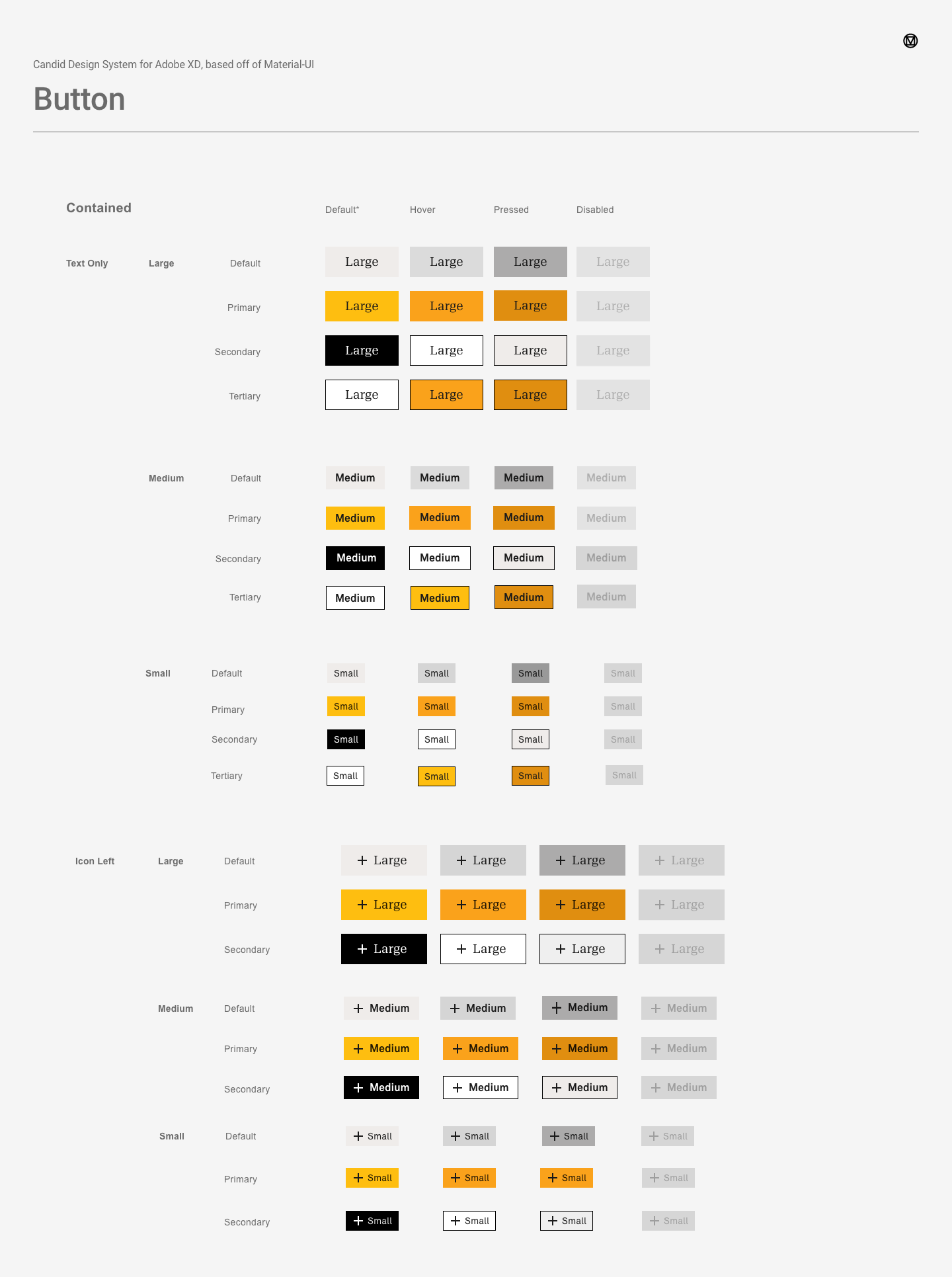
Candid Components, version 2
Having the Material-UI framework was extremely helpful in terms of organization, naming conventions, states, and overall seeing what a complete design system inventory looks like. However, the Adobe XD file we were working from was unfortunately very unwieldy. Having that many components and states in one file led it to be very slow and hard to collaborate on, leading me and my fellow developer constantly making copies of components and rebranding them in other files.
I returned to my original Candid Design System file and chose to iterate on my existing components, using what I had learned from the Material-UI framework.
Conclusion
This library was shared with the internal design team, as well as external design and development consultants. Having these reusable components available in a shared Adobe XD library has greatly increased the efficiency and consistency of Candid projects. It is a work in progress and will be added to by the design team moving forward - truly a living, breathing, design system! My obsession with detail and rules was truly at place here, and I would love to work on more design systems in the future.